- TemplatesTemplates
- Page BuilderPage Builder
- OverviewOverview
- FeaturesFeatures
- Layout BundlesLayout Bundles
- Pre-made BlocksPre-made Blocks
- InteractionsInteractions
- DocumentationDocumentation
- EasyStoreEasyStore
- ResourcesResources
- DocumentationDocumentation
- ForumsForums
- Live ChatLive Chat
- Ask a QuestionAsk a QuestionGet fast & extensive assistance from our expert support engineers. Ask a question on our Forums, and we will get back to you.
- BlogBlog
- PricingPricing
Before After
The Before After Addon lets you effortlessly showcase transformations or visual changes with a captivating before-and-after effect. Upload two images, and users can compare changes side by side. Like other SP Page Builder addons, the Before After addon is fully customizable.
General Settings
Content Before
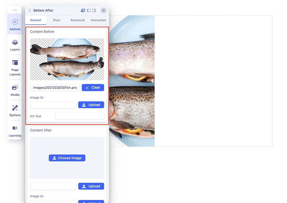
In the Content Before section, add an image to show the appearance before any alterations. For example, insert an image of raw cooking ingredients in their uncooked state.
- Image 2x: Upload 2x image here which is the optimized image for the Retina display.
- Alt Text: A brief description of an image that is used for conveying the image's meaning when it cannot be viewed for various reasons.
Content After
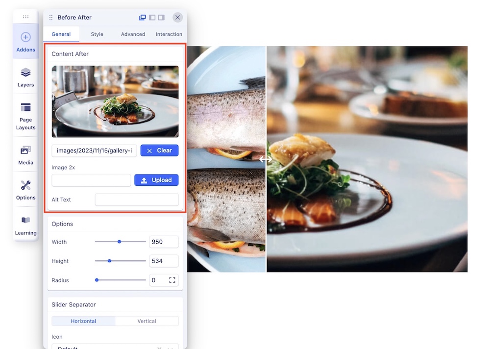
In the After Content section, add an image to show the appearance after the alteration took place. For example, insert an image of the prepared dish featured in the "Before Content" section to illustrate its final state after cooking.
- Image 2x: Upload 2x image here which is the optimized image for the Retina display
- Alt Text: A brief description of an image that is used for conveying the image's meaning when it cannot be viewed for various reasons.
Options
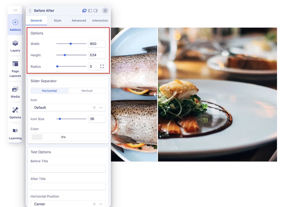
- Width: Adjust the overall width of the addon
- Height: Adjust the overall height of the addon.
- Radius: Adjust the radii of the 4 corners of the addon. When the width and height are equal, increasing and fine-tuning the addon's radii can result in a circular shape for the before-after addon.
Slider Separator
The slider separator is the icon positioned at the center of the addon to divide the before and after images allowing users to slide it to reveal the before-after changes. There are 2 ways you can display the slider separator: Horizontal and Vertical.
Horizontal
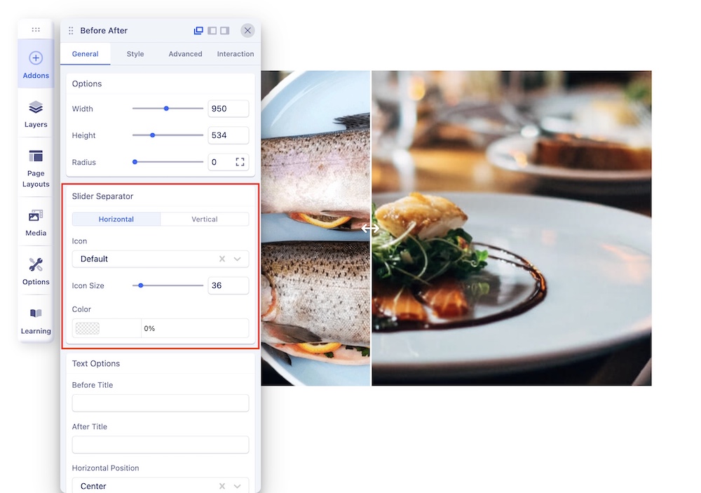
This keeps the position of the before image and after image side by side with the slider separator placed horizontally in between the images.
- Icon: Choose an icon for the Slider Separator from the dropdown list. You can choose between Default and Chevron options.
- Icon Size: Set the size of the Slider Separator icon.
- Color: Choose a color for the Slider Separator icon. In case you don’t want to display the icon, set the opacity value to zero.
Vertical
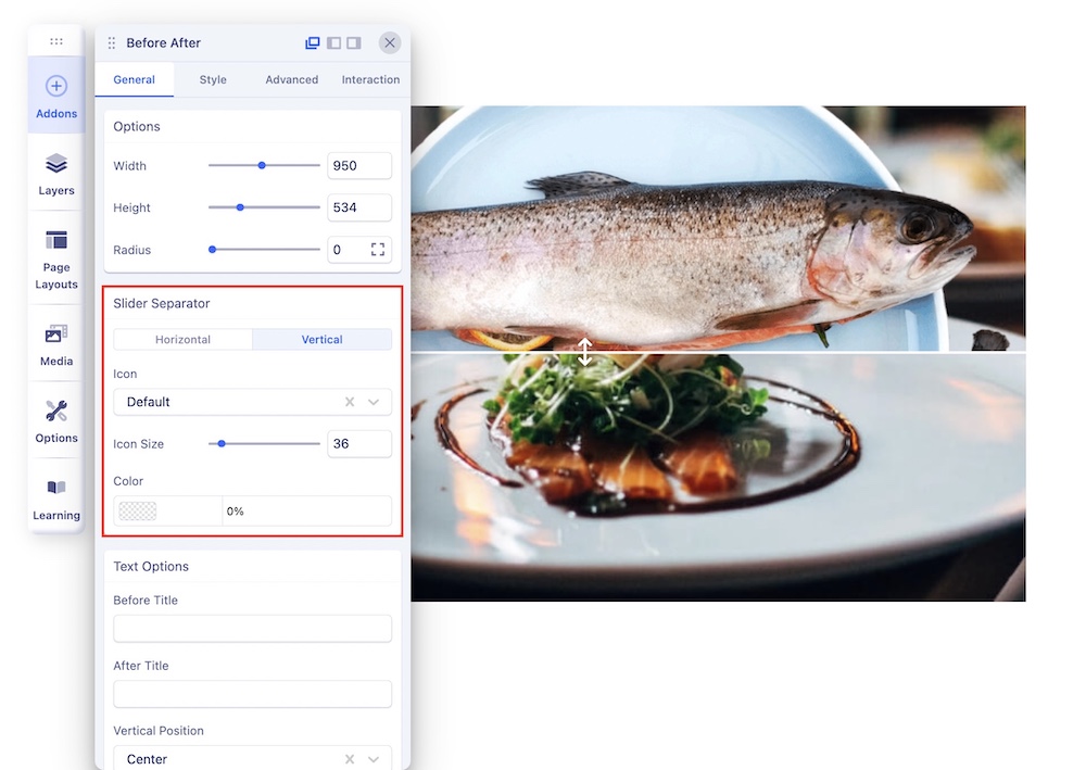
This keeps the position of the before image and after image on top of each other with the slider separator vertically placed between the images.
- Icon: Choose an icon for the Slider Separator from the dropdown list. You can choose between Default and Chevron options.
- Icon Size: Set the size of the Slider Separator icon.
- Color: Choose a color for the Slider Separator icon. In case you don’t want to display the icon, set the opacity value to zero.
Text Options
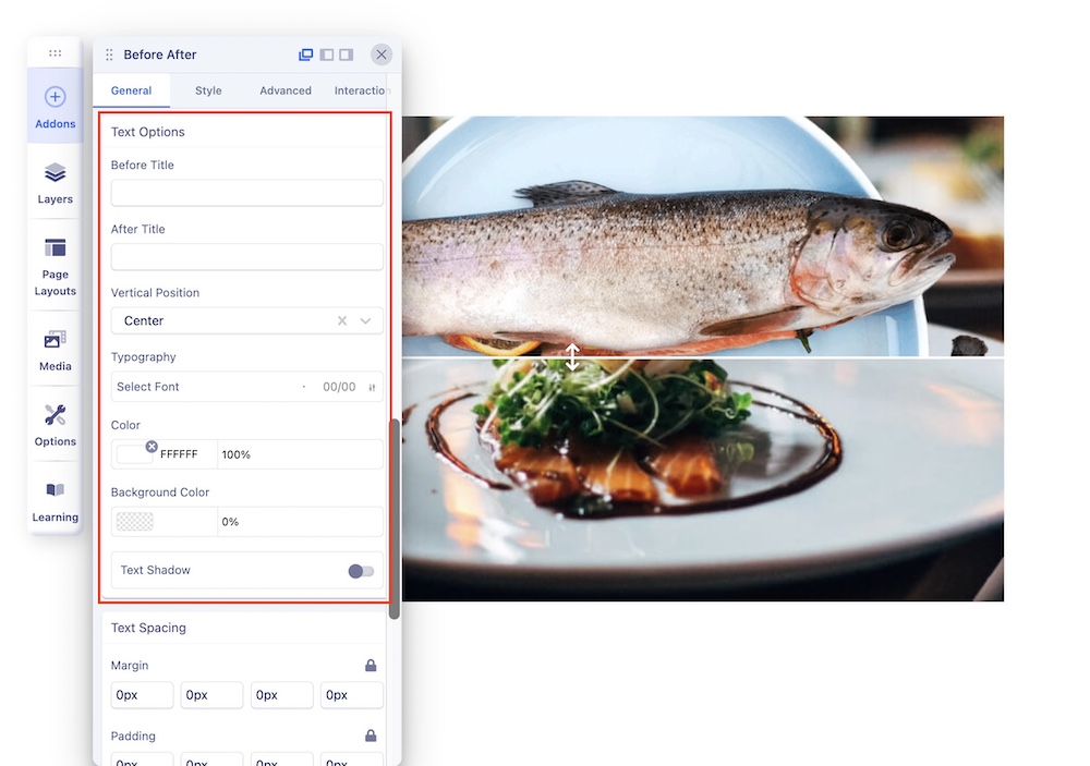
- Before Title: Add a title in the given field for your before image.
- After Title: Add a title in the given field for your after image.
- Horizontal/Vertical Position: Choose a position from the dropdown list for placing the Before title and After title.
- Typography: Customize the Before After Title’s font, font size, line height, letter space, style, and weight.
- Color: Choose a color for the Before After Title.
- Background color: Choose a background color for the Before After title’s background.
Text Spacing
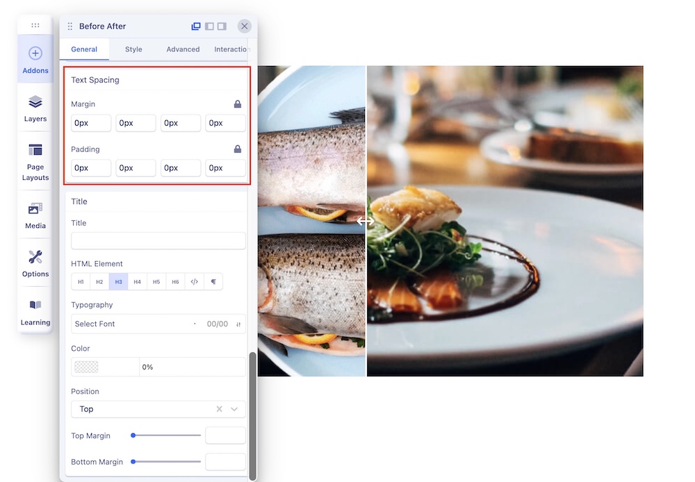
- Margin: Add margin to the top, right, bottom, and left of the Before and After titles.
- Padding: Add padding to the top, right, bottom, and left of the Before and After titles.
Title
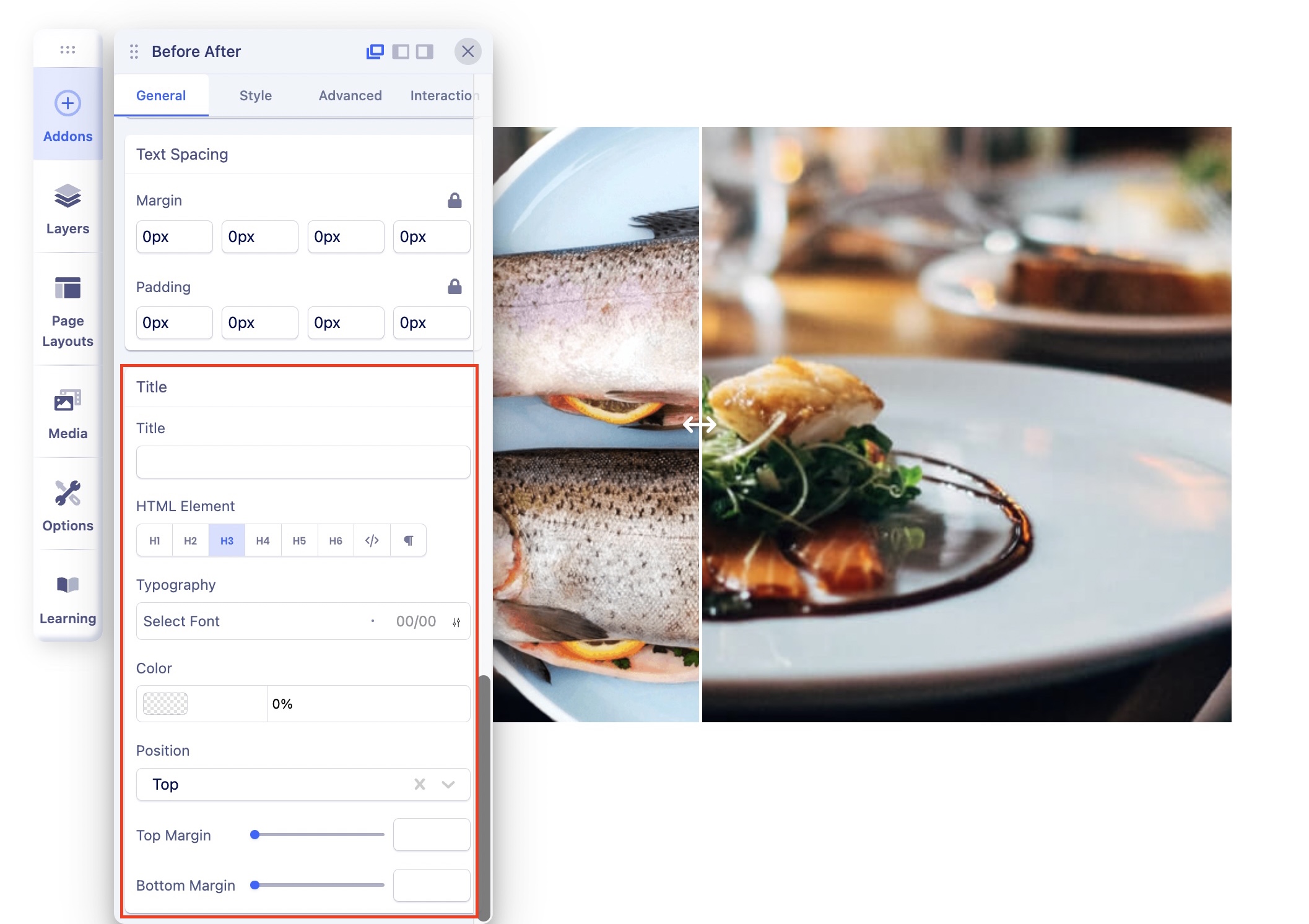
- Title: Add a title for your Before After addon.
- HTML Element: The <h1> to <h6> tags are used to define the HTML headings according to their importance.
- Typography: Adjust the typography settings of your title from here.
- Color: Choose a color for the Title text.
- Position: Choose a position for the title from the dropdown list. You can select from the Top or Bottom option.
- Top Margin: Add a margin to the top of the Title.
- Bottom Margin: Add a margin to the bottom of the Title.

