- TemplatesTemplates
- Page BuilderPage Builder
- OverviewOverview
- FeaturesFeatures
- Layout BundlesLayout Bundles
- Pre-made BlocksPre-made Blocks
- InteractionsInteractions
- DocumentationDocumentation
- EasyStoreEasyStore
- ResourcesResources
- DocumentationDocumentation
- ForumsForums
- Live ChatLive Chat
- Ask a QuestionAsk a QuestionGet fast & extensive assistance from our expert support engineers. Ask a question on our Forums, and we will get back to you.
- BlogBlog
- PricingPricing
Testimonial Carousel
A Testimonial Carousel is a smart way to display positive user reviews of a product or service. Showcasing testimonials on your website is a great way to boost its credibility and deepen visitors’ trust.
Using this addon, you can display your Testimonials in a beautiful carousel on your webpage quite easily.
How to Add a Testimonial Carousel Addon?
You can add the Testimonial Carousel addon to your page from the SP Page Builder sidebar. Simply drag the addon from the Addons panel and drop it on the section of the page where you want to add the Testimonial Carousel.
Content
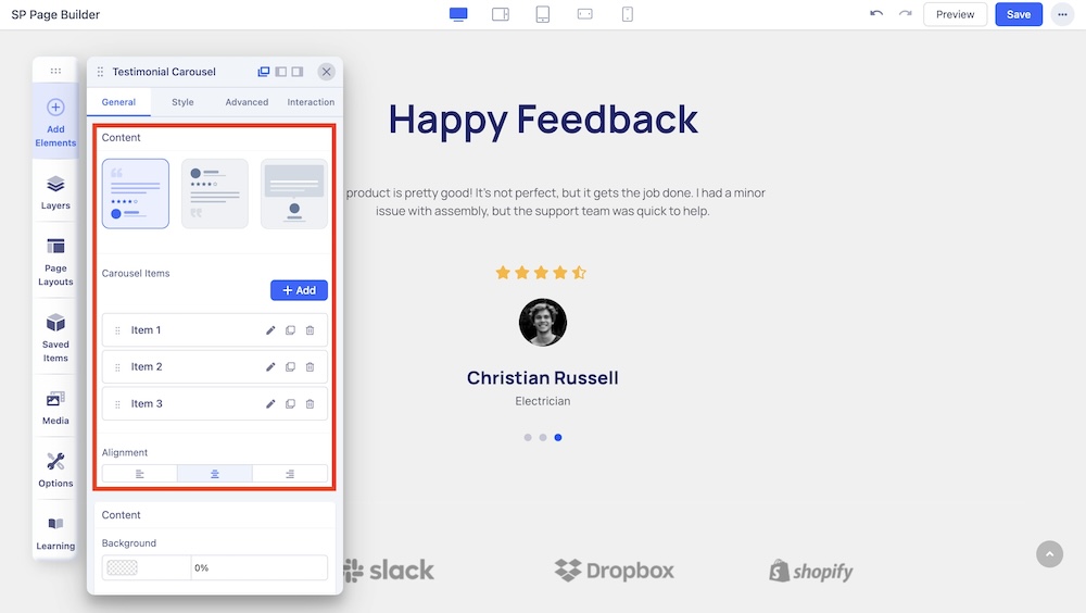
Content: You can showcase your team carousel in 3 different layouts. Select your desired carousel layout and customize it your way. 3 of these carousel layouts vary on the basis of their content and image positioning. Each of these layouts is unique and has its own design needs.
Carousel Items: Add and edit items for the carousel. Click on the edit icon beside each carousel to customize the carousel item.
- Admin Label: Use the text field to enter the admin label of the client.
- Name: Use the text field to enter the name of the client.
- Client Designation: Use the text field to enter the designation of the client.
- Client Message: Use the text field to enter the message of the client.
- Show Client Rating: Enable to display the rating on the carousel.
- Client Rating: Use the slider or the input field the add the rating from the client.
- Client Image: Upload a display image of the client using the upload option.
- Alt Text: Set an alt text for the display image of the client.
Alignment: Select the alignment of the carousel.
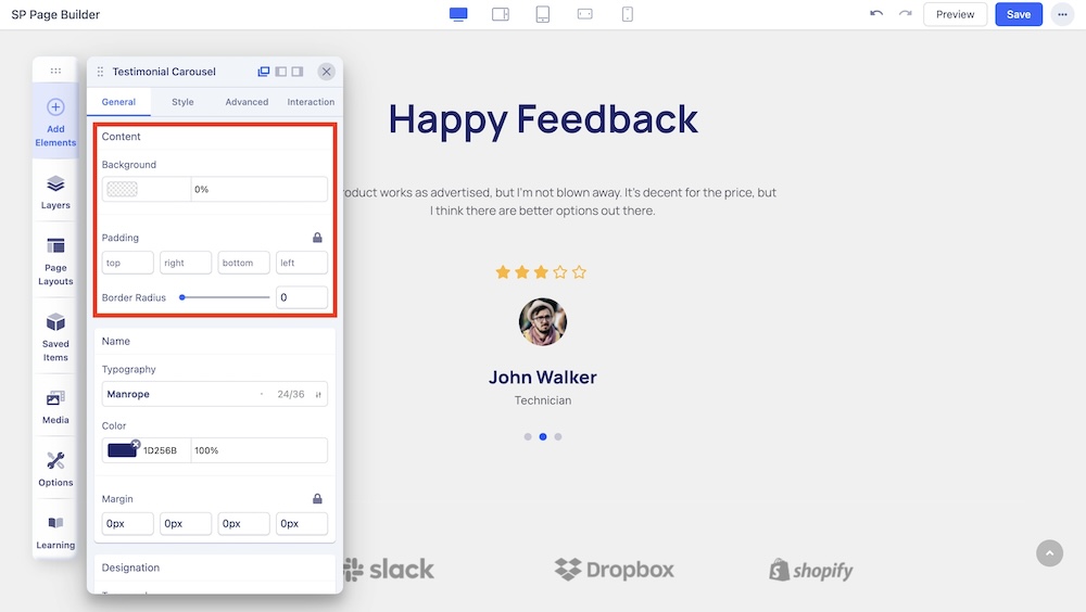
Background: Choose the background color.
Padding: Adjust padding.
Border Radius: Adjust the border radius of the carousel.
Name

Change the typography options such as the font and font color of the names displayed in the carousel. Also, adjust the margins of the name.
Designation
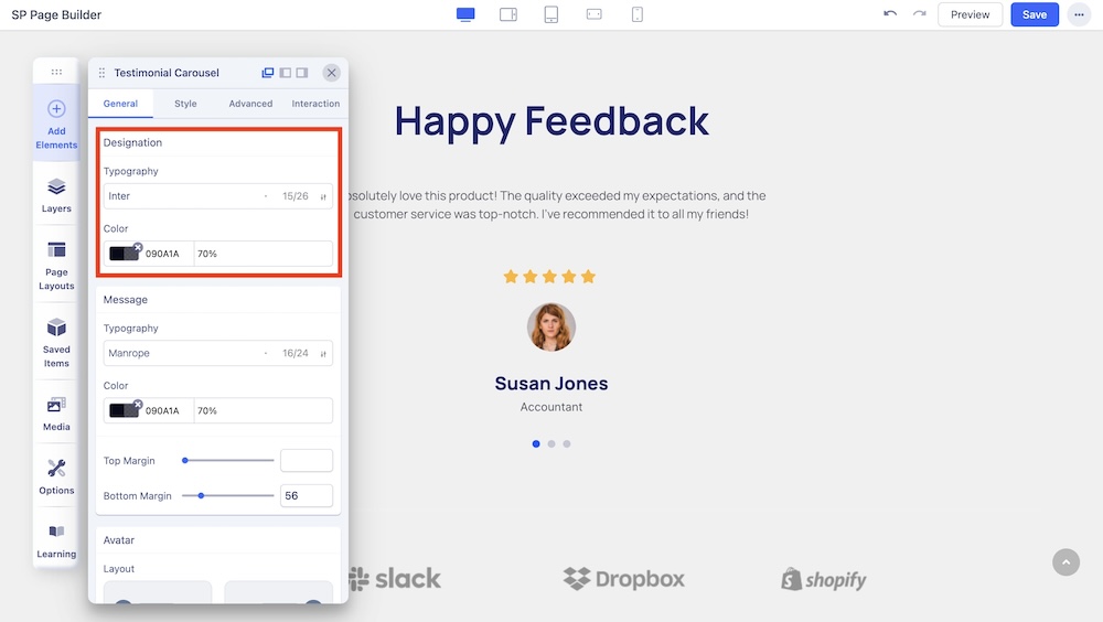
Change the typography options such as the font and font color of the designations displayed in the carousel.
Message

You can customize the font size, style, color, and margin of the message in this section.
Avatar
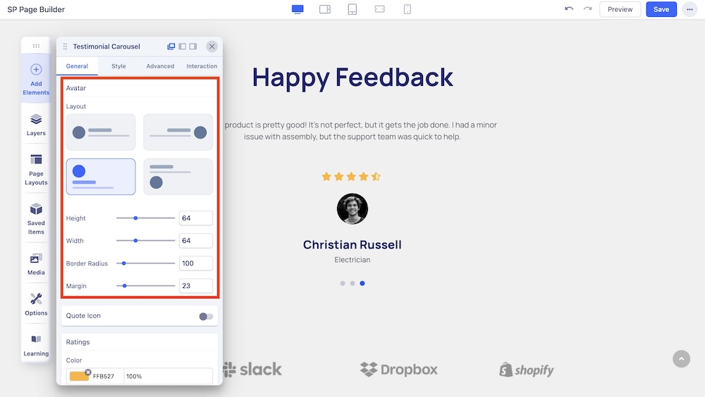
You can customize the layout of the avatar from four different options. You can also adjust the height, width, border radius, and margin of the avatar in this section.
Quote Icon

You can enable the quote icon and adjust the color, size, and margin of the quote icon.
Ratings
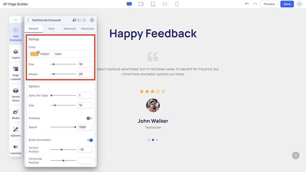
You can adjust the color, size, and margin of the ratings icons.
Options

Items Per Slide: Use the slider or the input field to set the number of items to be displayed per slide.
Autoplay: Enable autoplay to slide to the next item in the carousel.
Speed: Set the speed at which elements in a Carousel will slide to the next.
Interval: Set the time interval in which elements in a Carousel will slide to the next. This option appears if Autoplay is enabled.
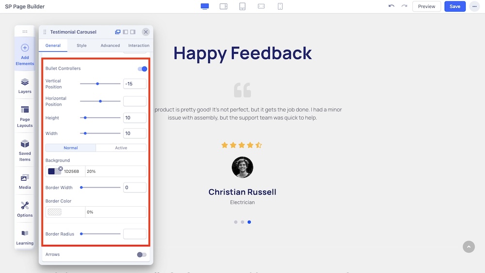
Bullet Controllers: Enable to show Bullets to slide the next item in the carousel. If you choose to enable Bullet Controllers, you will get the following options:
- Vertical Position: Position of the bullet vertically.
- Horizontal Position: Position of the bullet horizontally.
- Height: Adjust the height of the bullet.
- Width: Adjust the width of the bullet.
- Background: Adjust the background color of the bullet.
- Border Width: Set the border width of the bullet.
- Border Radius: Set the border radius of the bullet.
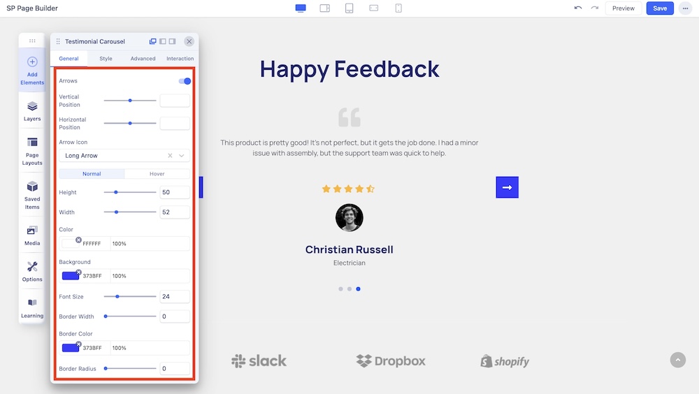
Arrows: Enable to show arrows that point left and right to slide to the next item in the carousel. If you choose to enable arrows, you will get the following options:
- Vertical Position: Position of the arrow vertically.
- Horizontal Position: Position of the arrow horizontally.
- Arrow Icon: Choose to set Angle icon or Long Arrow icon.
- Height: Adjust the height of the arrow.
- Width: Adjust the width of the arrow.
- Color: Adjust the color of the arrow.
- Background: Adjust the background color of the arrow.
- Font Size: Adjust the size of the typography.
- Border Width: Set the border width of the arrow.
- Border Color: Set the border color of the arrow.
- Border Radius: Set the border radius of the arrow.

