- TemplatesTemplates
- Page BuilderPage Builder
- OverviewOverview
- FeaturesFeatures
- Layout BundlesLayout Bundles
- Pre-made BlocksPre-made Blocks
- InteractionsInteractions
- DocumentationDocumentation
- EasyStoreEasyStore
- ResourcesResources
- DocumentationDocumentation
- ForumsForums
- Live ChatLive Chat
- Ask a QuestionAsk a QuestionGet fast & extensive assistance from our expert support engineers. Ask a question on our Forums, and we will get back to you.
- BlogBlog
- PricingPricing
Testimonial Pro
A Testimonial Pro is a smart way to display positive user reviews of a product or service in a slider. Showcasing testimonials on your website is a great way to boost its credibility and deepen visitors’ trust.
Using this addon, you can display your Testimonials on your webpage quite easily.
How to Add a Testimonial Pro Addon?
You can add the Testimonial Pro addon to your page from the SP Page Builder sidebar. Simply drag the addon from the Addons panel and drop it on the section of the page where you want to add the Testimonial Pro.
Content
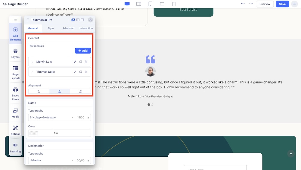
You can find the following settings under the Content section in the General Settings:
Add: Click on the +Add button to add a new testimonial. You will get the following options after expanding:
- Name: Use the text field to enter the name of the client.
- Designation: Use the input field to insert the designation of the client.
- URL: Use the input field to insert the URL of the client’s profile.
- Avatar: Set the display image of the client using the upload image option.
- Alt Text: Add an alt text for the display image of the client.
- Message: Use the text field to enter the message of the client.
Alignment: Select the alignment of the carousel.
Name
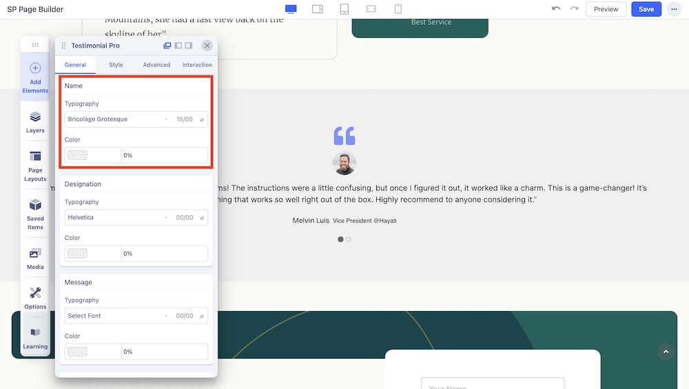
Change the typography options such as the font and font color of the names displayed in the carousel.
Designation
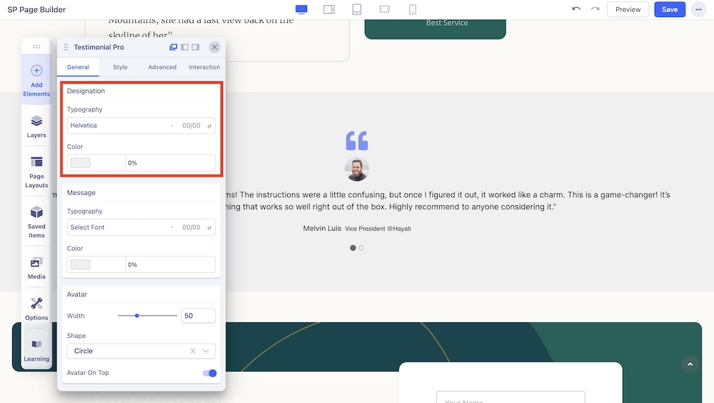
Change the typography options such as the font and font color of the designations displayed in the carousel.
Message
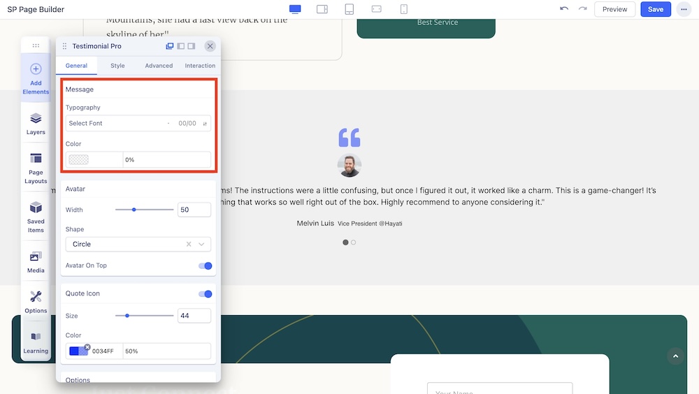
You can customize the font size, style, color, and margin of the message in this section.
Avatar
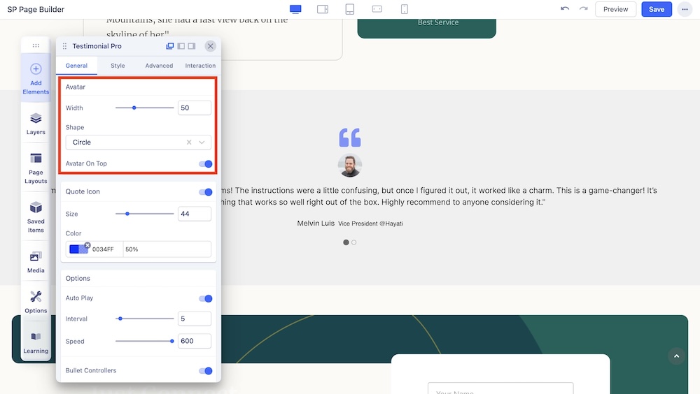
You can customize the width, shape, and position of the avatar in this section.
Width: Use the slider or the input field to set the width of the client’s avatar.
Shape: Choose the shape of the avatar to be either square, round, or a circle.
Avatar On Top: Enable to display the avatar on top.
Quote Icon
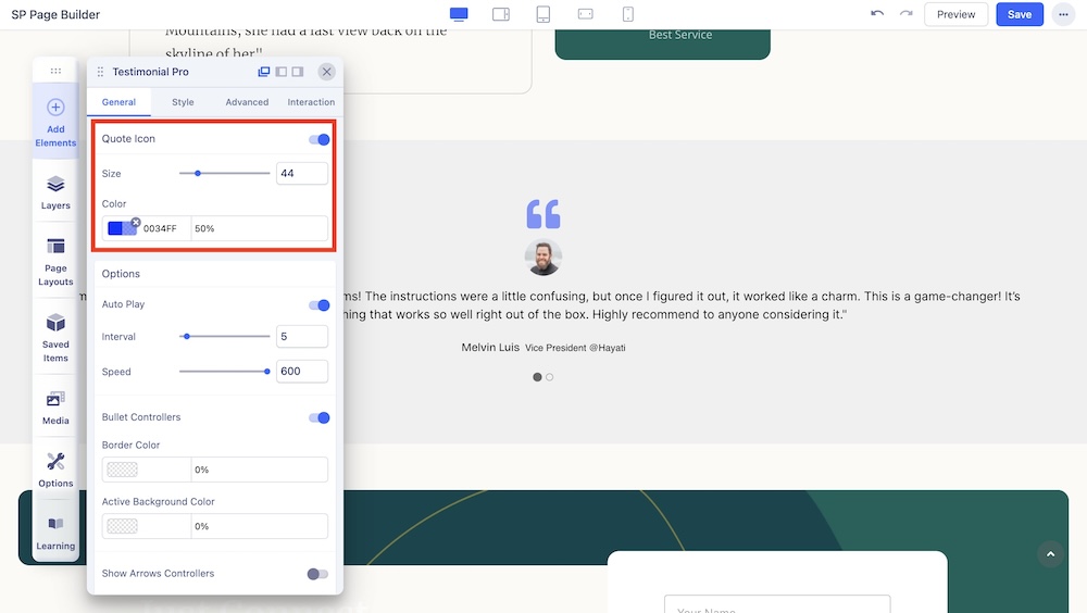
You can enable this option to show the quote icon around the testimonial message and adjust the color and size of the quote icon.
Size: Use the slider or the input field to set the icon size.
Color: Select the color of the quote icon.
Options
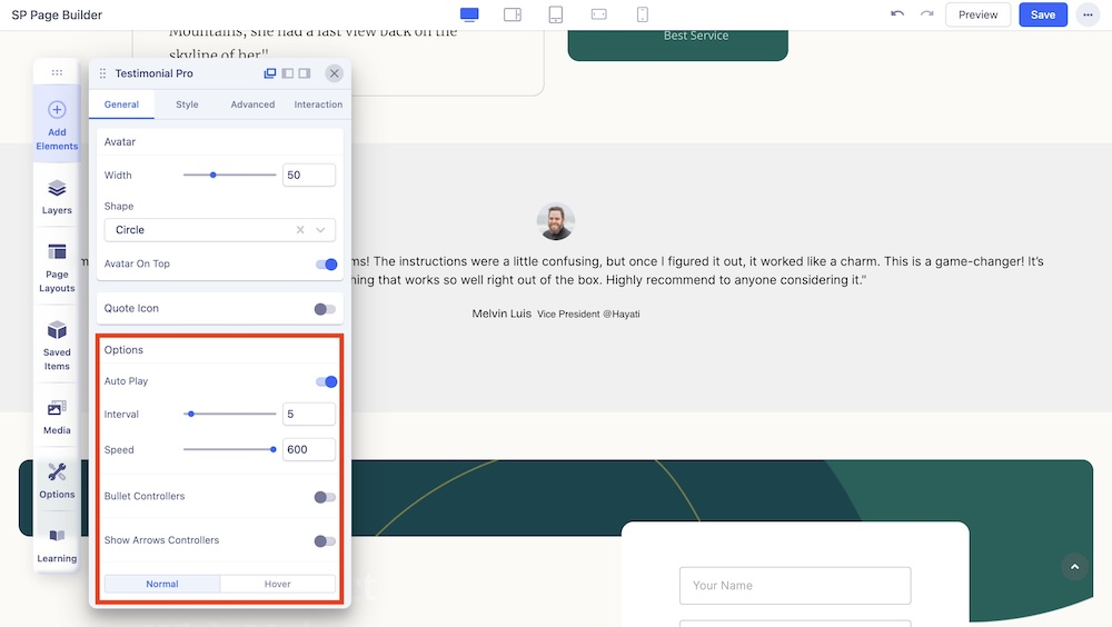
Here you will find the following options for further carousel customization:
Autoplay: Enable autoplay to slide to the next item in the carousel.
Speed: Set the speed at which elements in a Carousel will slide to the next.
Interval: Set the time interval in which elements in a Carousel will slide to the next. This option appears if Autoplay is enabled.
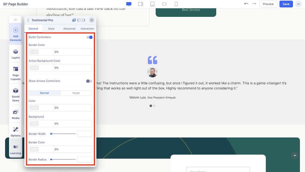
Bullet Controllers: Enable to show Bullets to slide the next item in the carousel. If you choose to enable Bullet Controllers, you will get the following options:
- Border Color: Set the border color of the bullet.
- Active Background Color: Set the active background color of the bullet.
- Color: Choose the color and depending on Normal or Hover Setting, you can set whether the color will remain static or animate on hover.
- Background: Choose the background color.
- Border Width: Set the border width of the arrow.
- Border Color: Set the border color of the arrow.
- Border Radius: Set the border radius of the arrow.
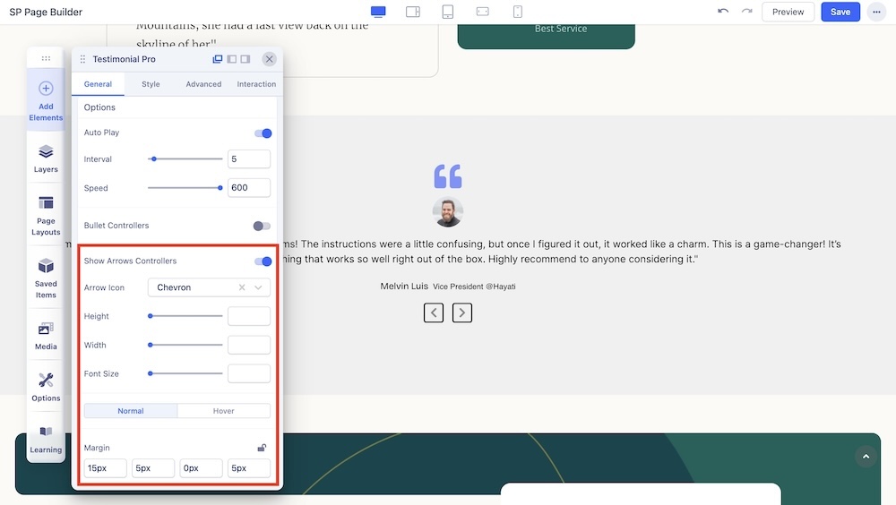
Show Arrows Controllers: Enable to show arrows that point left and right to slide to the next item in the carousel. If you choose to enable arrows, you will get the following options:
- Arrow Icon: Choose between Angle, Angle Double, Arrow, Arrow Circle, Long Arrow, and Chevron icons.
- Height: Adjust the height of the arrow.
- Width: Adjust the width of the arrow.
- Color: Adjust the color of the arrow.
- Font Size: Adjust the size of the typography.
- Margin: Adjust the margins of the arrows.

