- TemplatesTemplates
- Page BuilderPage Builder
- OverviewOverview
- FeaturesFeatures
- Layout BundlesLayout Bundles
- Pre-made BlocksPre-made Blocks
- InteractionsInteractions
- DocumentationDocumentation
- EasyStoreEasyStore
- ResourcesResources
- DocumentationDocumentation
- ForumsForums
- Live ChatLive Chat
- Ask a QuestionAsk a QuestionGet fast & extensive assistance from our expert support engineers. Ask a question on our Forums, and we will get back to you.
- BlogBlog
- PricingPricing
Carousel Pro
Carousel Pro is an exclusive slider addon of SP Page Builder. The addon is similar to the Carousel addon but added with more customization options.
How to Add a Carousel Pro Addon
You can add a Carousel Pro addon to your page from the SP Page Builder sidebar. Simply drag the addon from the Addons panel and drop it on the section of the page where you want to add a Carousel Pro addon.
Content
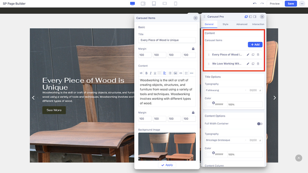
In the General tab, you will first get the option to add items to the Carousel and edit them. For each item, you can edit the title, and content, add background images and overlaying images, as well as buttons and much more.
When you click on the +Add button in the Carousel Pro settings, the addon’s general settings will open up. You can edit your slider’s title, replace & upload images, add links, access color settings, etc from here.
- Carousel Item Title: This option will allow you to add a title to the slider item. The purpose of the title is to express the naming of the section you just added to the addon.
- Title Margin: Set the optimum margin for your title.
- Content: Use this editor field to enter your alert content here. Arrange your content in your desired way using this content field. Carousel content will be shown on top of the carousel image.
- Content Padding: Set optimum padding to your content.
- Carousel Background Image: In Pro, you can add a carousel background image. Use the SP Page Builder media manager to upload your desired carousel background image.
- Carousel Image: Use SP Page Builder's well-developed media manager to upload the images of the carousel. You can upload images by adding multiple items.
- Video: If you want to add a Youtube or Vimeo video, Enter the full URL of the YouTube or Vimeo single video. The URL must have to contain HTTP or HTTPS.
- Button Text: The button text is the text that will be displayed on top of the button. It’s quick on what that button is going to do. Leave it blank if don’t want any button.
- Button Link: The button link is the absolute URL of the page that will be linked. Remember the link must contain http:// or https:// in the URL. URL can be sensitive, so the double-check will let you be on the safe side.
- Button Icon: There are lots of icons there to choose from. You can find almost every type of icon there. Use the search field on the top to find your desired one. Select the one you want from the list.
- Button Icon Position: Set the icon position of your button from the Left or Right side.
Title Options
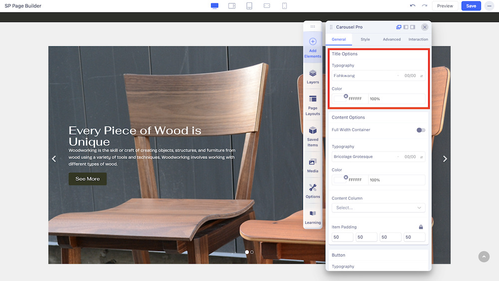
You can adjust the typography and color of the title with Title Options.
Content Options
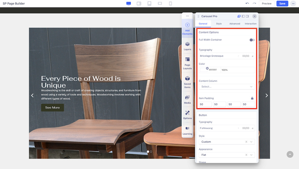
You can edit the Content Options of the addon to fit your needs.
- Full Width Container: Set whether the container will span the full width of the page.
- Typography: Change the font of the text within the container.
- Color: Adjust the color of the container.
- Content Column: Set the number of columns in the container.
- Item Padding: Adjust the padding between the items in the container.
Button
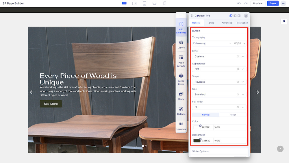
You have several parameters that you can set for the Button of the carousel.
- Typography: Select the typography of the button.
- Style: Select from a list of pre-made styles or choose a custom style which you can edit from the Styles Settings tab.
- Appearance: Select from a list of pre-made appearances such as Flat, Gradient, and Outline.
- Shape: Select a shape from Rounded, Square, and Round.
- Size: Set the size from a variety of options.
- Full Width: Choose whether your button will encompass the full width of the page or not.
- Color: Use the Color tab settings to edit the color of your added button. You can choose to keep the color static via the Normal setting or select Hover to change the color upon hover.
Slider Options
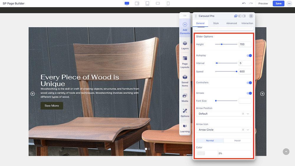
You can scroll down to find Slider Options and customize the addon to fit your needs.
- Height: Set the height of your Carousel.
- Autoplay: Autoplay is the function of auto-rotating the images and content without any click from the user. If you want that feature, set the carousel to autoplay.
- Interval: Select the interval speed between each sliding item.
- Speed: Set an optimum slider speed.
- Controllers: Enable this if you want to display the bullet controllers.
- Arrows: Arrows are there to direct the flow of images and content in a specific direction. If you enable the option the navigation arrows will show up in the carousel. Navigation arrows are shown on both sides of the carousel.
- Font Size: Adjust the font size of the carousel.
- Arrow Position: Adjust whether the arrow will be in Bottom Left, Bottom Right or Bottom Center.
- Arrow Icon: Select the type of Arrow Icon you wish to use, from Angle, Angle Double, Arrow, Arrow Circle, Long Arrow, and Chevron.
- Color: Select a color for the slider and also choose whether it will remain static or change color on hover.

