- TemplatesTemplates
- Page BuilderPage Builder
- OverviewOverview
- FeaturesFeatures
- Layout BundlesLayout Bundles
- Pre-made BlocksPre-made Blocks
- InteractionsInteractions
- DocumentationDocumentation
- EasyStoreEasyStore
- ResourcesResources
- DocumentationDocumentation
- ForumsForums
- Live ChatLive Chat
- Ask a QuestionAsk a QuestionGet fast & extensive assistance from our expert support engineers. Ask a question on our Forums, and we will get back to you.
- BlogBlog
- PricingPricing
Settings/Style Panel
The settings panel of the backend editor sits comfortably on the right side of the screen, without blocking your canvas view. Access all the settings related to addons, sections, and columns in one place.
Section Settings

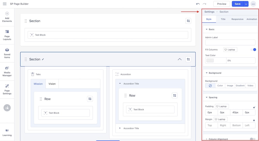
The section-related settings have been organized into 4 different tabs to simplify your editing experience.
- Style: Adjust your Section’s settings related to styling like Text Color, Background styles, Spacing, Border, etc.
- Title: Add the Section Title and Section Subtitle from this tab and choose their alignment.
- Responsive: Choose to hide or show your section’s settings on different devices according to your preference.
- Animation: Easily add different animations for your section. There are a total of 6 different Animations available to choose from and clicking on each of them will display their respective settings to further adjust animation for your sections.
Column Settings

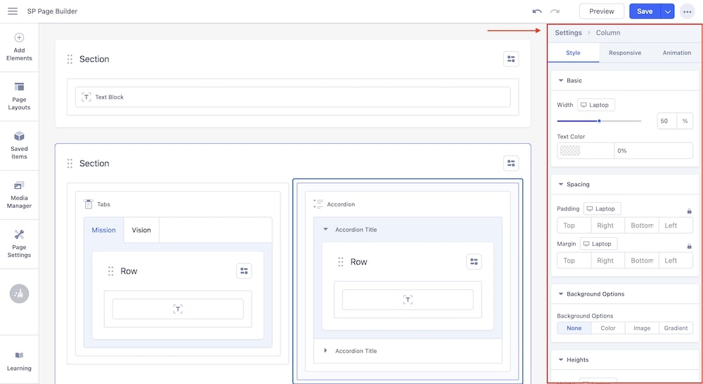
The column-related settings are arranged in 3 different tabs comprising Style, Responsive, and Animation. You can easily access the column setting just by clicking on the column boundary.
- Style: Set your column's padding, margin, background color, etc from the Style tab.
- Responsive: Responsive tab provides options for Column Ordering and Visibility options on different devices. Set the order of your columns on different devices using the Column Ordering option and you can also choose to hide your column settings on different devices using the Visibility option.
- Animation: Enable the Animation option to implement animations in your column. Click on each of the animations will display its related settings to adjust the animation according to your preference.
Addon Settings

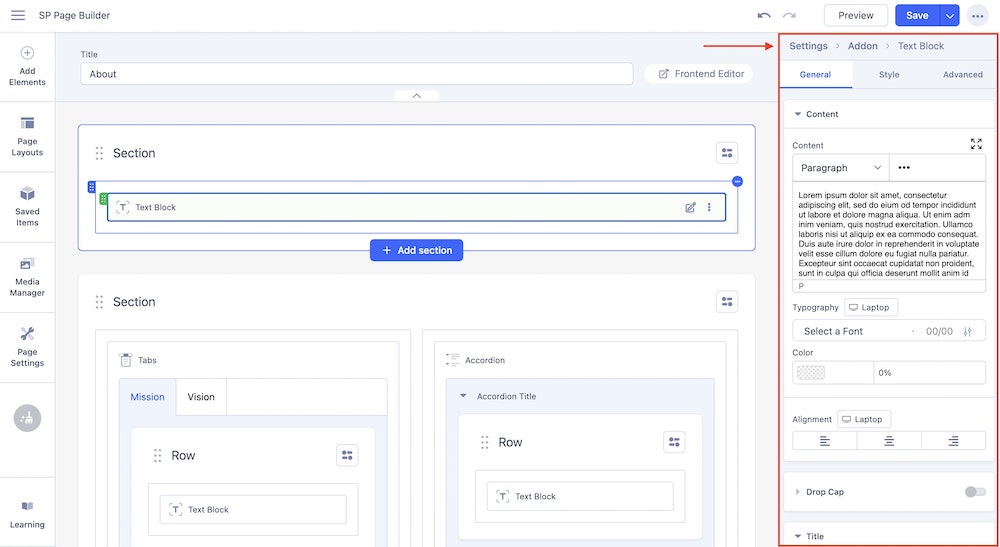
All the addon-related settings have been arranged in 3 different tabs - General, Style, and Advanced.
- General: The General Settings contains all the addon-specific settings. You can easily access and edit your addons according to your preference from the General tab.
- Style: Add styling to your addon from the Style tab. Along with the basic style settings related to the addon, this tab offers you space to implement your custom CSS code. You can also access Animation settings from the Style settings.
- Advanced: The Advance styling tab contains advanced settings like Responsive settings, adding width to your addons, and miscellaneous settings like choosing Access Level and Admin Label. You can also set interactions for your addons from the Advanced settings.
Addon Options

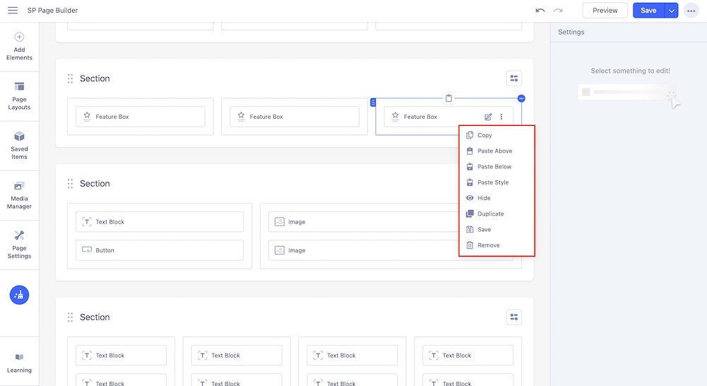
There are a number of fixed and handy options you can find with each addon. When you add an addon to a section or column, each addon will come with the following options:
- Copy: Choose this option to copy the currently selected addon.
- Paste Above: This will paste the copied addon just above your currently selected addon within that column.
- Paste Below: This will paste the copied addon just below your currently selected addon within that column.
- Paste Style: Paste only the style-related settings of the copied addon. You can only paste the style to addons that are the same as the addon that you copied. For example: If you have copied a Text Block addon, you can only paste the style to another Text Block addon.
- Hide: Choose this option to hide the currently selected addon. The preview of the page will not show the hidden addon.
- Duplicate: The duplicated addon will be placed instantly at the bottom of the column.
- Save: Save the currently selected addon to use it later on the same page or any other page.
- Rename: Rename the selected addon.

