- TemplatesTemplates
- Page BuilderPage Builder
- OverviewOverview
- FeaturesFeatures
- Layout BundlesLayout Bundles
- Pre-made BlocksPre-made Blocks
- InteractionsInteractions
- DocumentationDocumentation
- EasyStoreEasyStore
- ResourcesResources
- DocumentationDocumentation
- ForumsForums
- Live ChatLive Chat
- Ask a QuestionAsk a QuestionGet fast & extensive assistance from our expert support engineers. Ask a question on our Forums, and we will get back to you.
- BlogBlog
- PricingPricing
Pricing Table
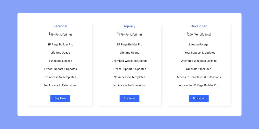
The Pricing Table addon is a block that can be used to showcase any service or product’s Pricing Plans. Normally, creating such a thing can be time-consuming but with this pre-made addon, you can design your pricing page in no time!
How to add a Pricing Table
To add a Pricing Table, open the Addons Panel and find this addon under the Content section. Drag & drop it to your webpage onto the area where you want it placed.
Pricing Table Settings
Now that you’ve added the Pricing Table addon, it’s time to replace the default text with actual content and customize it. To do this click on the Pricing Table icon on the inline editor to open its settings.
Title
First up is the Title tab from where you can give your Pricing Table an appropriate Title.
Title: Enter the text for the Title
HTML Element: Set the HTML element hierarchy as H1, H2, H3, etc.
Top Margin: Set the top margin of your Title.
Bottom Margin: Set the bottom margin of your Title.
Features
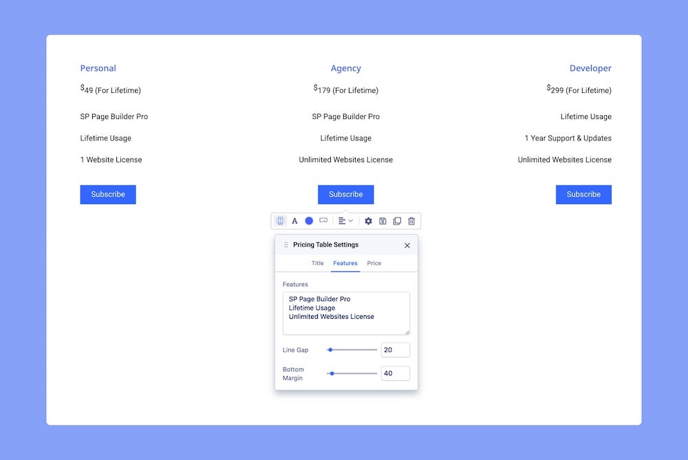
Next, go to the Features tab to list the product features and customize how their appearance.
Features: List the product’s features line by line inside this input field.
Line Gap: Set the Line Gap which is the space between each feature item.
Bottom Margin: Set the Bottom Margin which is the space between the last feature item and the button.
Price
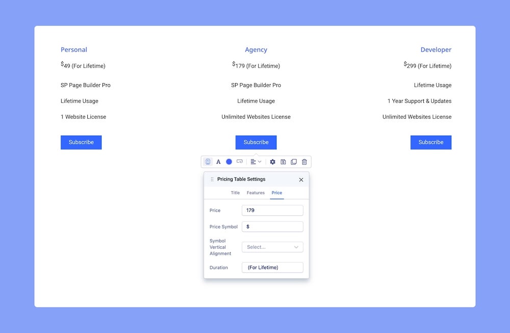
From the Price tab, you can set the price of your Product.
Price: Define the Price of your product.
Price Symbol: Set the Price’s currency.
Duration: Set how long you will get access to this product/service if purchased at this Price. For instance, it could be per day, month, year, etc.
Typography Settings
Click on the ‘A’ Letter icon on the inline editor to open the Typography window. Here, you can adjust the Font, Font Size, Line Height, etc for the text in your Pricing Table. For detailed information on Typography check out this documentation.
Color Settings
Change your Pricing Table’s color scheme using the Color Settings. Click on the Circle icon from the inline editor to open this window. Here, you will be able to change the color of the Title, Features, and Price. Clicking on the color box will open the Color Picker window where you can easily select the color you want.
More on Color Settings here.
Alignment
To adjust the Pricing Table’s Alignment, click on its icon on the inline editor. Alignment options include Left, Center, Right, and Justified.
Button Settings
The Pricing Table ends with a Call-To-Action Button, a must if you want to easily redirect your prospective customers to your purchase page. To start customizing this button to suit your purposes open the Button Settings by clicking on the Button icon on the inline editor.
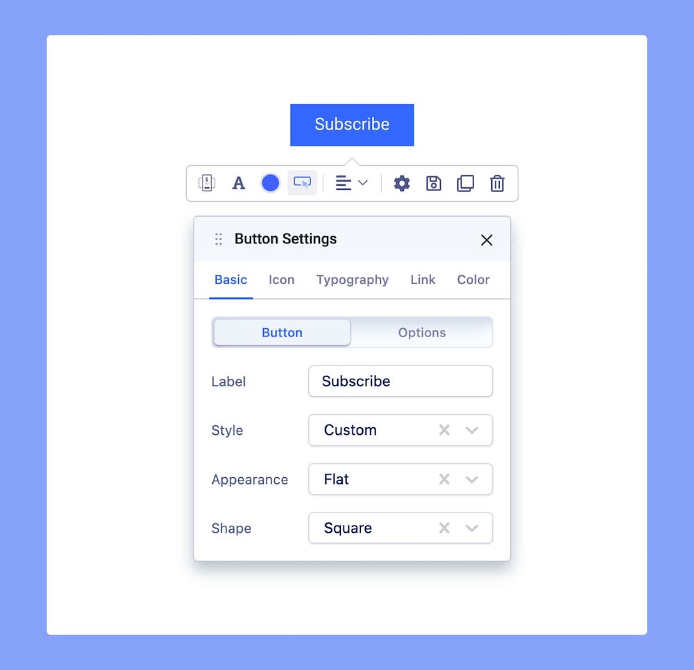
Under the Basic tab, set the button text in the Label field. You can also set the Style, Appearance, and Shape from here. Finally, define the Button’s destination link from the Link tab.
For a more in-depth guide to Button Settings, check out its dedicated documentation.
Pricing Table General Settings
Further Pricing Table customizations can be done from Settings > General. To open this panel, click on the Settings icon on the inline editor.
Symbol
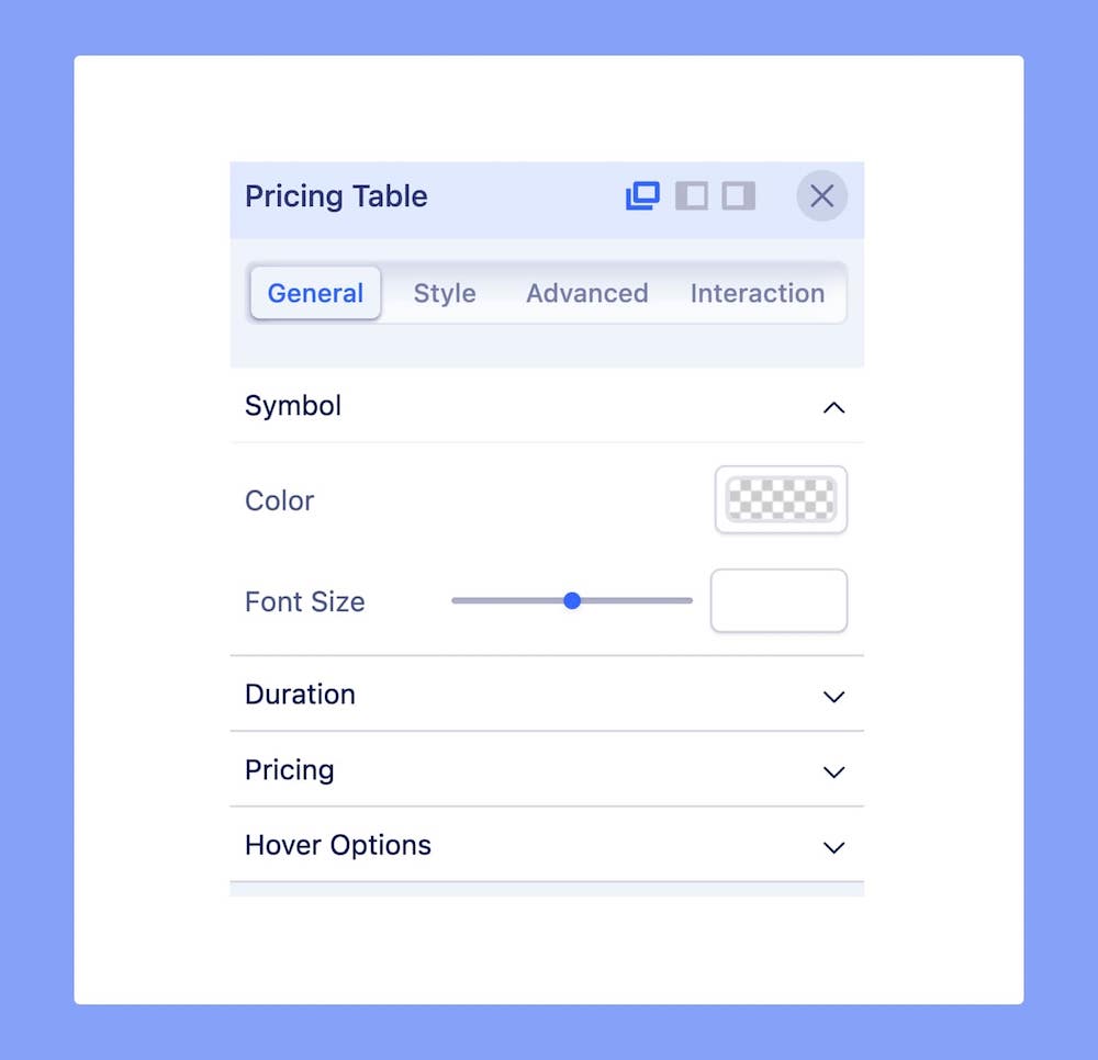
Color: Set the Currency Symbol’s Color from here.
Font Size: Adjust the Currency Symbol’s Font Size from here.
Duration
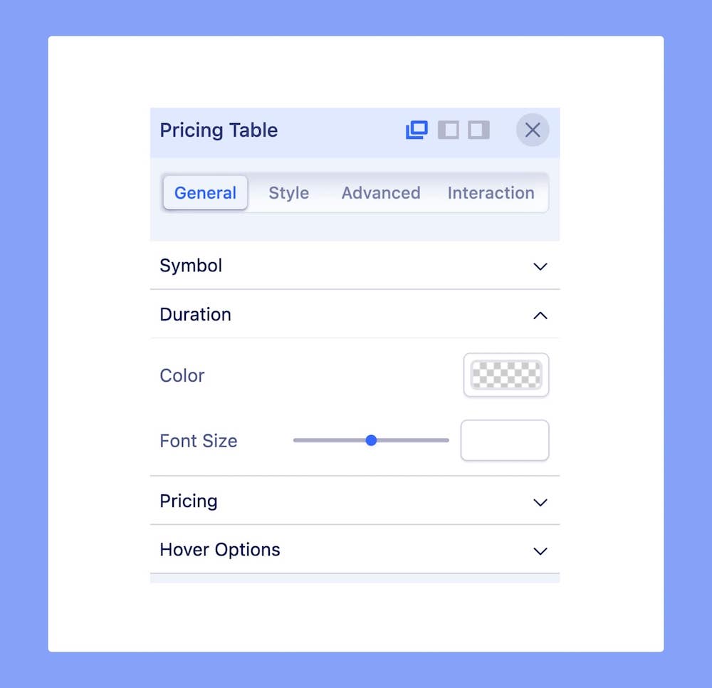
Color: Set the Duration’s Color from here.
Font Size: Adjust the Duration’s Font Size from here.
Pricing
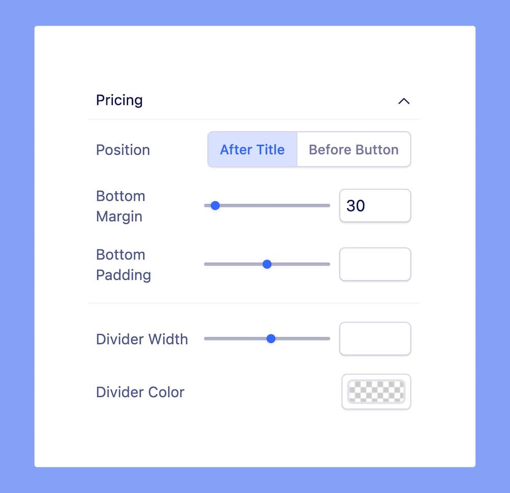
Under Pricing, you’ll find several options to customize the look of the Pricing in the Pricing Table.
Position: Set the Pricing’s placement. Options include After Title and Before Button.
Bottom Margin: Set the Pricing’s Bottom Margin. This is the space between the element’s bottom margin and outer space.
Bottom Padding: Set the Pricing’s Bottom Margin. This is the space between the content and its bottom border.
Divider Width: Define the width of the Divider that will appear after Pricing, separating it from the list of Features.
Divider Color: Define this Divider’s color.
Hover
Here are some interesting options which will trigger when users hover over the Pricing Table:
Scale: Set how large the Pricing Table will scale to in hover mode.
Text Color: Set the color of the Pricing Table’s text in hover mode.
Background Color: Set the color of the Pricing Table’s background in hover mode.
Border Color: Set the color of the Pricing Table’s border in hover mode.
Hover Box Shadow: Enable a box shadow effect when in hover mode. When enabled, you will get to access more options to customize the Box Shadow Effect. To learn more, check out its documentation.

