- TemplatesTemplates
- Page BuilderPage Builder
- OverviewOverview
- FeaturesFeatures
- Layout BundlesLayout Bundles
- Pre-made BlocksPre-made Blocks
- InteractionsInteractions
- DocumentationDocumentation
- EasyStoreEasyStore
- ResourcesResources
- DocumentationDocumentation
- ForumsForums
- Live ChatLive Chat
- Ask a QuestionAsk a QuestionGet fast & extensive assistance from our expert support engineers. Ask a question on our Forums, and we will get back to you.
- BlogBlog
- PricingPricing
Image Overlay
Image Overlay addon is a fun element that can be used to layer an image with a Color Overlay as well as a Title and Subtitle. This works particularly well for headers, banners, etc. with its eye-catching structure.
How to Add Image Overlays
Open the Addons Panel by clicking on the Addons button on the Sidebar or using the plus icon found within a Row. Scroll to the Media section and drag & drop the Image Overlay addon onto your canvas.
Content

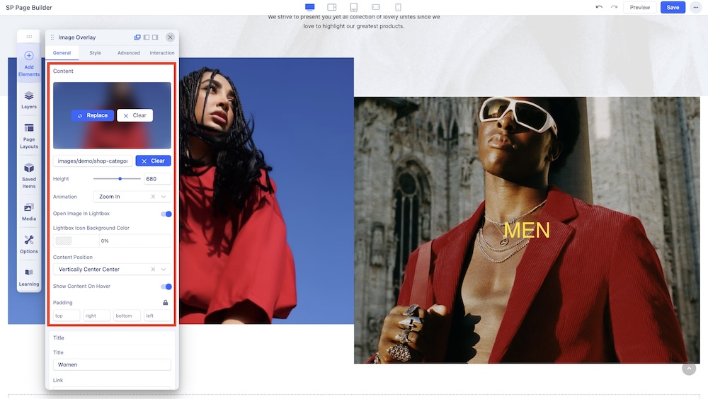
In the Content section under the General tab, you will also be presented with the following options:
Choose Image: Opens the Media Manager from where you can select the image you want to use. After adding the Image, an Image Thumbnail will replace the Choose Image button. Initially, you will get the following additional options:
- Replace: Hover over the Thumbnail to find the Replace button which will open the Media Manager
- Clear: Click on this button to remove this image and add another one.
Image URL: If the image you want is online, you can simply paste its URL into the text field beside the Upload button.
Upload: Also opens Media Manager and from here you can click on the Upload Files option to upload your Image.
Height: Define the Height of the Image.
Animation: Select the Animation style of the Image.
Open Image In Lightbox: Enable this option to open this Image within a Lightbox.
Content Position: Select the position of the Content. Options include Top Left, Top Center, Top Right, Vertical Center Left, Vertical Center Center, Vertical Center Right, Bottom Left, Bottom Center, and Bottom Right.
Show Content On Hover: Make content visible only when hovered over.
Padding: Set the Content’s padding.
Title

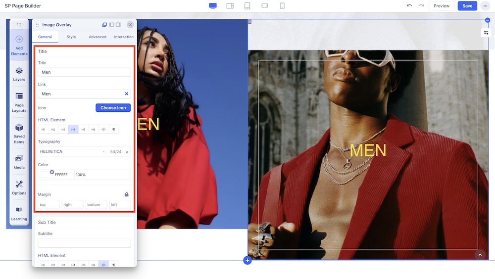
You can also give Image Overlay a Title. Go to the Title section on the General Settings to do this.
Title: Enter the text for the Title.
Link: Add a link to your title using the Link option.
- For URL, simply paste the web address you want to link to into the first field.
- For Menu, select the option you want to link to from the dropdown list. Note that the options on this list are all Menu Items that exist on your website.
- For Pages, select the option you want from the dropdown list. Like Menu, these options are all existing Pages available on this website.
- Lastly, you can enable the option Open in New Tab to open this link in a new tab, Add nofollow to tell search engines to ignore this link, Add Noreferrer to prevent any referrer information from being sent to the target resource, and Noopener to stop a third-party website you connect to from using the window object to take over the browser tab.
Icon: Choose an icon for your image overlay title.
HTML Element: Set the HTML element hierarchy as H1, H2, H3, etc.
Typography: Adjust the typography of the title.
Color: Select the Title’s Text Color.
Background: Select the Title’s Background Color.
Padding: Set the Padding of your Title.
Margin: Set the Margins of your Title.
Sub Title

Similar to Title, you have the option to set a Sub Title with similar parameters. The subtitle you enter here will appear just after the Title of your image.
Sub Title: Enter the text for the Sub Title.
Icon: Choose an icon for your image overlay subtitle.
HTML Element: Set the HTML element hierarchy as H1, H2, H3, etc.
Typography: Adjust the typography of the subtitle.
Color: Select the Sub Title’s Text Color.
Background: Select the Sub Title’s Background Color.
Margin: Set the Margins of your Sub Title.
Overlay Options

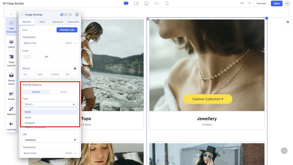
Under Overlay Options, you can set the overlay to normal or static, or give it a hover animation. Both options have these additional settings based on the type of overlay:
None: Select this option so that no background color is applied.
Color: Select this option to apply a solid color background.
- Background Color: In Solid Color mode, select the color you want your background to be.
Gradient: Select this option to apply a gradient color background.
- Color 1: Select the first Color for the Gradient.
- Color 2: Select the second Color for the Gradient.
- Start: Define how far the first color will spread.
- End: Define how far the second color will spread.
- Type: Select if the Gradient type will be Linear or Radial. A Linear Gradient is in a straight direction whereas a Radial Gradient is in a circular direction.
- Angle: Set the Angle of the Gradient.
Button

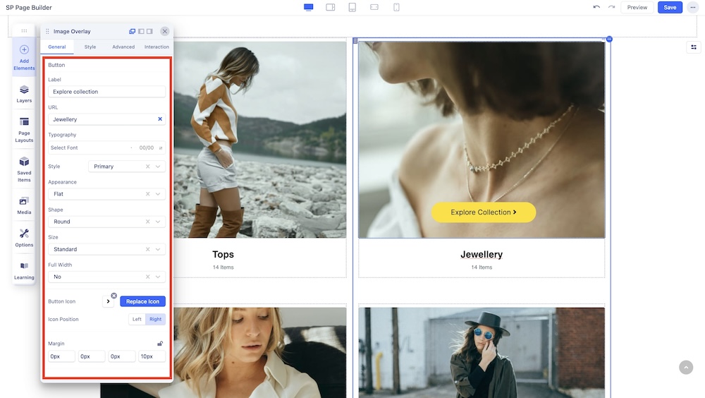
You edit the buttons of your image layout through this setting. This comes with the following customization options:
Label: Enter the label for your button.
URL: Add a link to your button using the Link option.
- For URL, simply paste the web address you want to link to into the first field.
- For Menu, select the option you want to link to from the dropdown list. Note that the options on this list are all Menu Items that exist on your website.
- For Pages, select the option you want from the dropdown list. Like Menu, these options are all existing Pages available on this website.
- Lastly, you can enable the option Open in New Tab to open this link in a new tab, Add nofollow to tell search engines to ignore this link, Add Noreferrer to prevent any referrer information from being sent to the target resource, and Noopener to stop a third-party website you connect to from using the window object to take over the browser tab.
Typography: Select the typography of the button.
Style: Select from a list of pre-made styles or choose a custom style which you can edit from the Styles Settings tab.
Appearance: Select from a list of pre-made appearances such as Flat, Gradient, and Outline.
Shape: Select a shape from Rounded, Square, and Round.
Size: Set the size from a variety of options.
Full Width: Choose whether your button will encompass the full width of the page or not.
Button Icon: You can click on Choose Icon to select icons from the icon library or upload your own icon.
Icon Position: Select the position of the Button Icon.
Margin: Adjust the top margin of the Button Icon.
Style: Choose whether the Button Icon will remain static or have a hover animation.
Color: Change the text color for the Button Icon.
Background: Choose the background color of the Button Icon.

